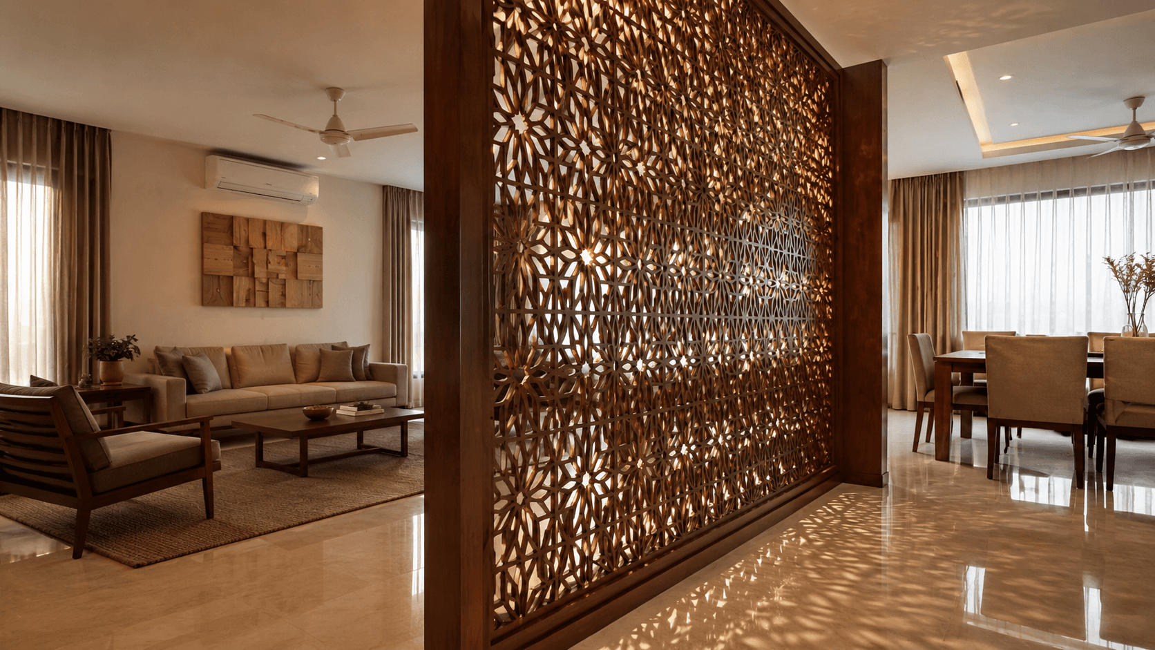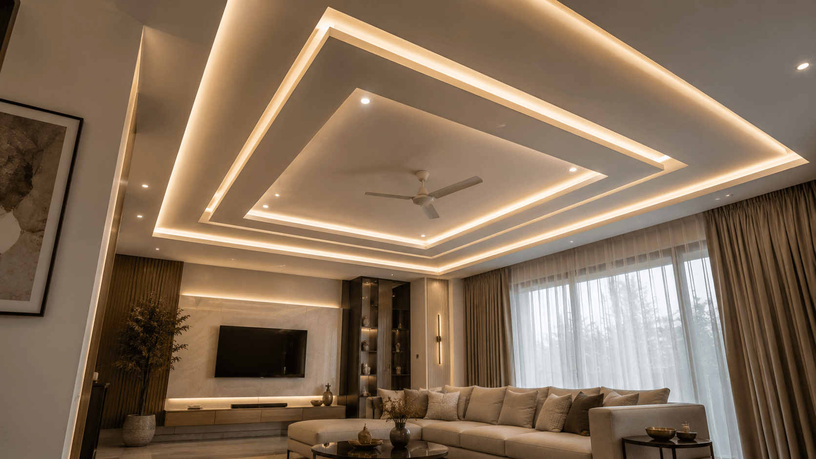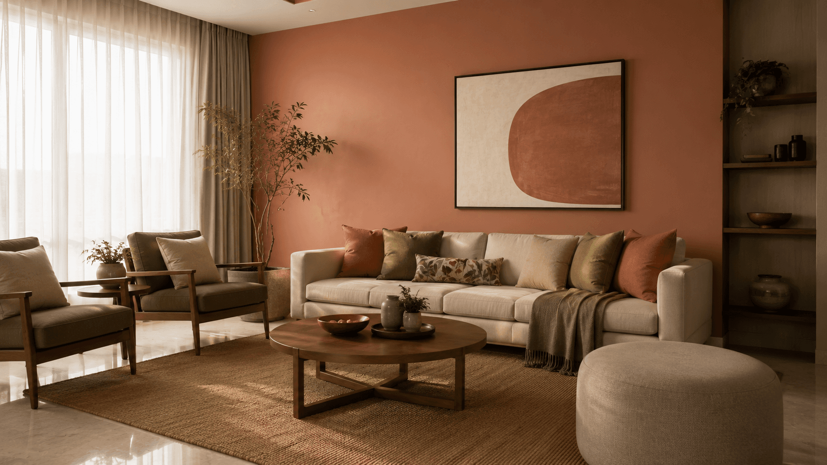
The four living room colour directions holding up in Delhi NCR homes in 2026 are warm neutral (beige, sand & walnut), deep green & brass used as an accent, off-white & textured white, and charcoal & black accents used sparingly. The living room is the one room most homeowners actually redo the colour of mid-way through a project, and it's an expensive change to make twice — repainting is cheap, but redoing curtains, upholstery, and rugs to match a colour switch isn't.
Warm Neutral — Beige, Sand & Walnut
Soft beige and sand-toned walls paired with walnut-tone furniture remain our most-requested living room direction for full home projects, and for good reason — warm neutrals don't fight with warm-white lighting the way cooler greys can look muddy under it, and the palette works whether the room gets strong daylight or relies mostly on evening lighting. It also ages well; a warm neutral base doesn't date the way a strong accent colour can within a few years. Honest read: still working strongly in 2026, with no signs of looking tired.
Deep Green & Brass
Bottle-green or forest-green used as an accent — one feature wall or upholstery on a single sofa — paired with brass hardware and warm wood reads rich without overwhelming a room. It works best exactly as an accent; saturating an entire living room in deep green tends to feel heavy in the smaller room dimensions common across Delhi NCR apartments. Brass-finish hardware and fixtures typically carry a 20–35% premium over standard matte black or chrome equivalents, which is worth budgeting for if you're going this direction. Honest read: still fresh as an accent, starting to look try-hard when applied as an all-over wall colour through multiple rooms of the same home.
Off-White & Textured White
Textured or lime-wash-style off-white walls, paired with natural materials — cane, linen, light wood — visually expand smaller combined living-dining layouts, which describes most 2–3BHK homes we work on across Ghaziabad and Noida. The catch is lighting: flat white under harsh overhead light reads cold and unfinished, so this palette depends on a warm, layered lighting plan more than any other direction on this list. Textured or lime-wash finishes typically cost approximately ₹18–35 per sq. ft. more than standard flat emulsion paint. Honest read: still working very well for smaller apartments, but without a texture layer or the right lighting, it reads as unfinished builder-white rather than intentional.
Charcoal & Black Accents
A contained charcoal or graphite accent wall behind a TV unit or sofa, lit with warm spotlighting so the room doesn't feel like a cave, works well in larger living rooms with good daylight during the day. It's a harder direction to pull off in the smaller, sometimes lower-light living rooms common across Delhi NCR flats. Honest read: overdone right now as a full statement wall in small spaces — we're seeing it age faster than the other three directions here — but still effective as a contained TV-unit backdrop rather than a full-room treatment.
What to Decide Before the Paint, Not After
Colour should be decided alongside your lighting plan, not after — a palette that reads warm and rich in a render can look completely different under your actual ceiling lighting, which is one reason retrofitting extra electrical points into a finished ceiling is expensive and something we've covered in our false ceiling design guide. Confirm your upholstery, curtain, and rug materials before finalising wall colour too; painting is the cheap part of a living room refresh, and it's rarely the part that ends up needing a costly redo. Our 2D/3D visualisation process exists specifically so you're approving a palette against your actual room and lighting, not a generic render.